


Picture this. You’re out shopping, looking to redecorate your living room ahead of summer. You stumble across the perfect vintage, floral print sofa. You rush over to your spouse to tell them the good news but they’re holding a pair of paisley curtains that they insist on buying! You can’t mix paisley with floral... can you? In fact, mixing patterns is definitely possible but you have to do it carefully. Your eyes need somewhere to rest so if every inch of your home is draped in plaid, polka dots and chintz, you’ll exhaust yourself just looking around! But never fear, we’re here with a handy guide on how to mix and match patterns with the sophistication of a full-time interior decorator.
Pattern Recognition

Recognizing patterns is a skill that will get you far in life and in home decorating, too! When it comes to picking fabric patterns it can be hard to know where to begin. Are you interested in repeating geometric patterns like stripes or polka dots? Or would you prefer a more complex pattern like argyle, plaid or paisley? Then there are prints that are full on illustrations: chintz, toile, floral or tropical, just to name a few! The pattern picking possibilities are endless, limited only by your ambition. Decorating with patterns means matching carefully. So before you head out to hunt for the ideal armchair, why not stop by a fabric store and look through their selection to familiarize yourself with the full diversity of available patterns? Then later, if you’re looking for a complementary pattern to the one you just chose, you can head back to the fabric store and pick up a length to drape over your new furniture or hang on your wall. If you fall in love with a pattern at the fabric store, try buying a little swatch of it to carry with you on the furniture hunt.
What Goes Where?
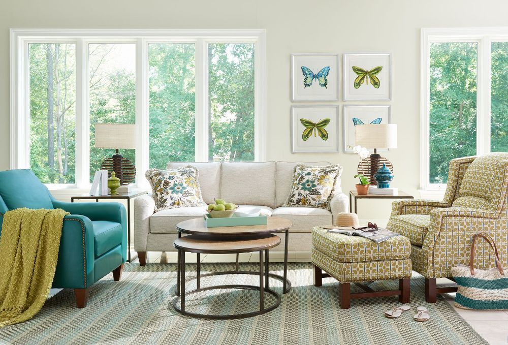
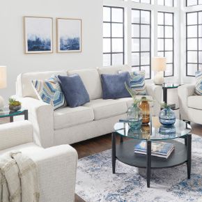
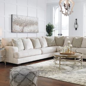
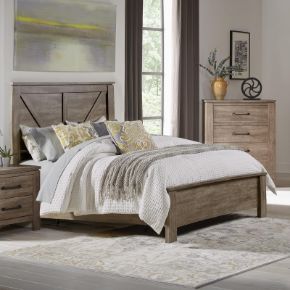
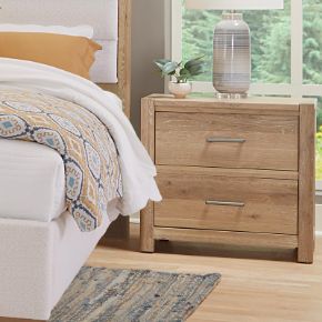
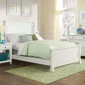
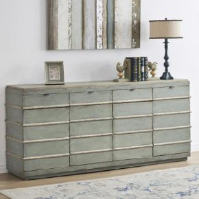
Hopefully, you’re feeling comfortable with the wide world of patterns and have some idea of the kinds of prints you’d like to add to your home decor. But how to combine them? The first thing to keep in mind is a sense of scale. When you’re mixing patterns, you want to avoid having three patterns of approximately the same size all in one space. For example, a living room with three different sofas in three different patterns would be hard on the eyes - not to mention a little bit crowded! So when mixing patterns, try to follow this rule: One big (like a piece of furniture) one medium (like a set of curtains) and one little (like throw pillows or a lampshade.) Three is probably about the maximum number of patterns it’s safe to mix in a room. While it may be tempting to give everything from the rug to the armrests on the sofa its own look, at a certain point things pass beyond busy and into noisy. You can also avoid this problem by spreading patterns evenly across a room, rather than concentrating them all in one spot. Keeping a good mix of proportion and even distribution will help your patterns mesh and give your room an organic feel.
A Match Made in Heaven

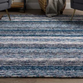
With a good sense for what patterns are out there and some general guidelines about placement and proportion, all that’s left is the matching! There are a number of great little tricks to bear in mind when looking to pair different prints. None of these are hard rules that you need to follow, and you might end up making some very funny design choices if you tried to do them all at once. But take these as helpful points of reference when picking fabrics and you can’t go wrong! One strategy is to seek thematic unity in your patterns. That could be as simple as pairing stripes with stripes or as tricky as matching wildflower print pillows with a forest themed blanket thrown over a dark green couch. That was a stealth segue into the next tip: pair mixed prints with neutral colors to keep things from getting overwhelming! Patterns and plain fabric alike should generally be in colors of similar intensity - don’t mix a neon green with a muted blue. On the other hand, it’s never a bad idea to use different prints with the same color scheme. You might also do the same print in different sizes, like a big polka dot couch with little polka dot pillows. This can help to manage the visual noise the patterns create and tie the aesthetic together.
